
This is a guest post by Stefan Bauer – Microsoft Office Development MVP, Web Developer and Information Architect – on a recently designed Office PnP Sample in collaboration with our own Waldek Mastykarz
Recently Waldek Mastykarz (@waldekm) and I developed a sample for the Office Dev Patterns and Practices. This sample queries contact information by using the Microsoft Graph. We also optimized the user interface for mobile use.
While Waldek took care of the technical development of this sample I was responsible for the user experience and user interface design.
Content First followed by Mobile and Cloud First
Whenever you sketch out the application, it is always a good decision to define the content first before you start to develop. This doesn’t mean that you need to know the actual content but it should include an idea what information should be included. A task that is easy for such a simple app.
The second step was to sketch out the mobile experience and user interface. Disconnected from the technical possibilities I thought of what an ideal application for contacts should look like. Especially I thought how I like to interact with the contact information provided by the app.Really soon in this process, it was clear to me that I would like to have a shortcut to all actions by swiping buttons over the contact information.
Really soon in this process, it was clear to me that I would like to have a shortcut to all actions by swiping buttons over the contact information. In addition to this, I thought a detailed view that keeps you in the context of the search result would be suitable too.
Followers of my blog might know that I have used atomic design to sketch and build user interfaces. I used it too for creating the user interface design and the user experience.
Sketching the contact
To design and prototype an Application you can spend your time in great tools such as PhotoShop, Illustrator, Sketch or any other application of your favor. In the case of web design, they are not really time efficient and sketching an application might take longer than starting directly in the browser.
In atomic design, you first define the smallest elements (atoms) of a user interface. Then you combine those small pieces to larger user interface components (molecules) and those will combine with even larger (organism). Finally, all the single components end up in templates and pages, that actually define the overall design of a website or application.
So let’s start with the small parts first.
The Buttons
The first thing that needs to be considered about the buttons was their actual size. I defined the buttons to be at least eleven millimeters high and wide.
Microsoft Windows 8 Touch Guidelines provided me with all the information that I need to know about designing a touch-enabled interface. Those guidelines were first released with Windows Phone 7 and are based on a research Microsoft did. Nowadays this research is the base of other style guides too.
In this document a recommended minimum size for touch-enabled user interfaces is defined with seven millimeters. Smaller clickable areas cause more problems when the user tries to click / touch them and the error rate of wrong clicks is much higher.
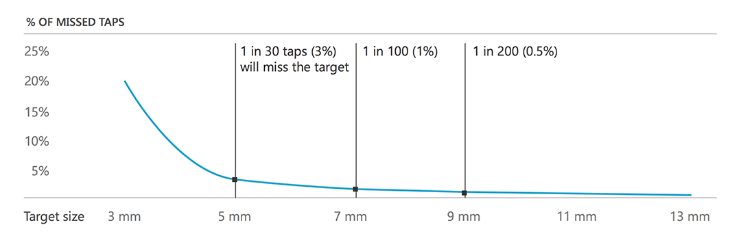
This guideline also shows that the average size of an index finger tip is around eleven millimeters. With all those considerations, I thought a size of eleven millimeters will give the application a good overall usability.
The next question was how large eleven millimeters actually are translated to pixel or em. To find the correct size for my buttons I create a reference button with a size of eleven millimeters. Actually, a millimeter is a valid unit to be used in CSS.
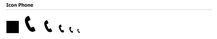
Besides the reference box, I added SVG icons in different sizes. From left to right the icons are 64px, 48px, 32px, 24px, 16px. With this small trick, I was able to identify the correct size of a button and used 32 pixels for them. This size matches best with the reference box.
The Button implementation
After I found the perfect icon size I implement the real buttons in two different flavors. One implementation is a real html <button>. In addition, I create a hyperlink button too.
The reason why I needed both implementations was that in general you should use a button when you trigger something on the user interface. For example, to close the detail view, it is better to have a button that performs this action.
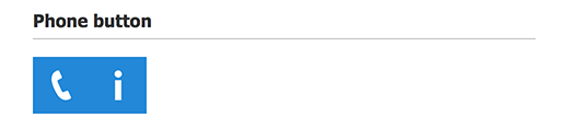
When you want to make a phone call you don’t need a button or a javascript. In this case, you simply need to define a hyperlink and prefix the phone number with ‘tel://’ This will force the device to open a phone call instead of opening a hyperlink.
You see it highly depends on what you try to accomplish and if you can do it natively without code. In this case, your application will be more fail safe. Only use code when it really is required and cannot be accomplished in another way.
Choose the right font size
Again, I created some atoms or patterns because I needed two different font sizes in this application.
The larger font should be used for the name of the contact person. The smaller font size I used for other text elements. These two different font sizes also give the application a better visual hierarchy. So it is a big plus for usability.
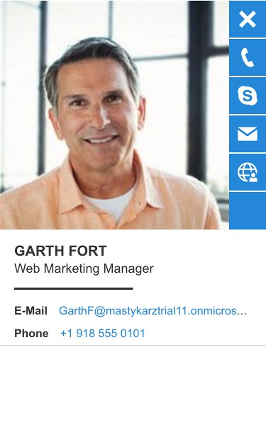
The profile picture
During the content design stage, I decided to have a profile picture next to the contact. I already designed the default button size so the size of the small profile picture was already defined.

Using the same size for profile pictures and buttons also gave the user interface a nice alignment.
Create a person element
After I created all the base elements, it was time to assemble them together. First, the person element in the list view needs to be created.

After that, I defined the detailed view of the person element.
In this step, I also defined how the transition between the list view and the detail view works. By adding a simple CSS class I was able to transform the element. All the animations were done using CSS3 transitions.
Button swipe and transformation
In addition to the contact cards, I also sketched out the button list with horizontal and vertical button alignment.

I added this list of buttons directly in the small style guide I implemented. On swipe, the buttons overlay the contact details. On click, the cards align with the right side of the contact card. I chose them to be on the right side because most people are right handed and hold their device in the right hand.
So for most people the user interface will be easier to use and you don’t have to stretch the thumb across the screen to reach the buttons. The last addition was to create a search box that followed the same pattern.
Additional things to know
SVG Buttons
Icon fonts in 2016 shouldn’t be used anymore because they have too many negative side effects. Especially when it comes to mobile device development, usability and accessibility. If you don’t trust me, I highly recommend you to watch the session ‘Death to icon font’ by Serena Davies. In this session, she explains a lot of those side effects and especially in the case of accessibility.
To accomplish the same thing just by using SVG, we used an SVG symbol set. If you are not familiar with this technique, it is no problem because it works the same was as an image sprite works for binary images. All icons are stored in a file named ‘icons.svg’ and contains all the glyphs of the Office 365 icon font. To add the SVG icons to the design the following code was used.
<svg class="icon icon-32">
    <use xlink:href="./images/icons.svg#icon-phone" x="0" y="0" class="icon-style"></use>
</svg>
The ‘link: href’ point of the icon file and the additional ‘#icon-phone’ reference the icon in the icon file. In this case, the icon for a phone was requested from the file.
This works great in any browser and mobile device except Microsoft Edge, Internet Explorer 11 and earlier.
Currently, Microsoft does not support external SVG files. If you like to use it you have to embed the full code of the SVG icon in your source code.
The good thing is that there is a polyfill available that adds this support to the Microsoft browsers. The name of this script is SVG4Everybody and is written in plain vanilla.js.
After we added this script we were able to support even Windows Phone 8 and older browsers that support inline SVG icons.
Final thoughts
I hope this blog post illustrated my ideas behind the user experience and user interface design. Especially how we used a modern development and design workflow by using atomic design.
In addition to this application, we created a simple style guide that can be further extended and improved in future. This workflow also improves the development process. I was able to hand over the HTML elements, the CSS file and some simple JavaScript files that demonstrate the behavior of this application. Waldek, on the other hand, focused on the Microsoft graph integration and implementation of the Angular application. The implementation of the application uses the exact same code style sheet that popped out of the style guide.
I think this shows that a perfect development team in the future consist of developer and designers. The Developer develops the code and the designer develops the user experience and user interface.
I really enjoyed working with Waldek on this because I got some really great feedback on the user interface and transition timings too.
If you like to check out this application you will find the code in the Office PNP Samples released in April 2016.
You will get a deeper look into the technical implementation in a blog post by Waldek coming up next week.
This blog post was originally published on Stefan’s blog at www.n8d.at/blog/